
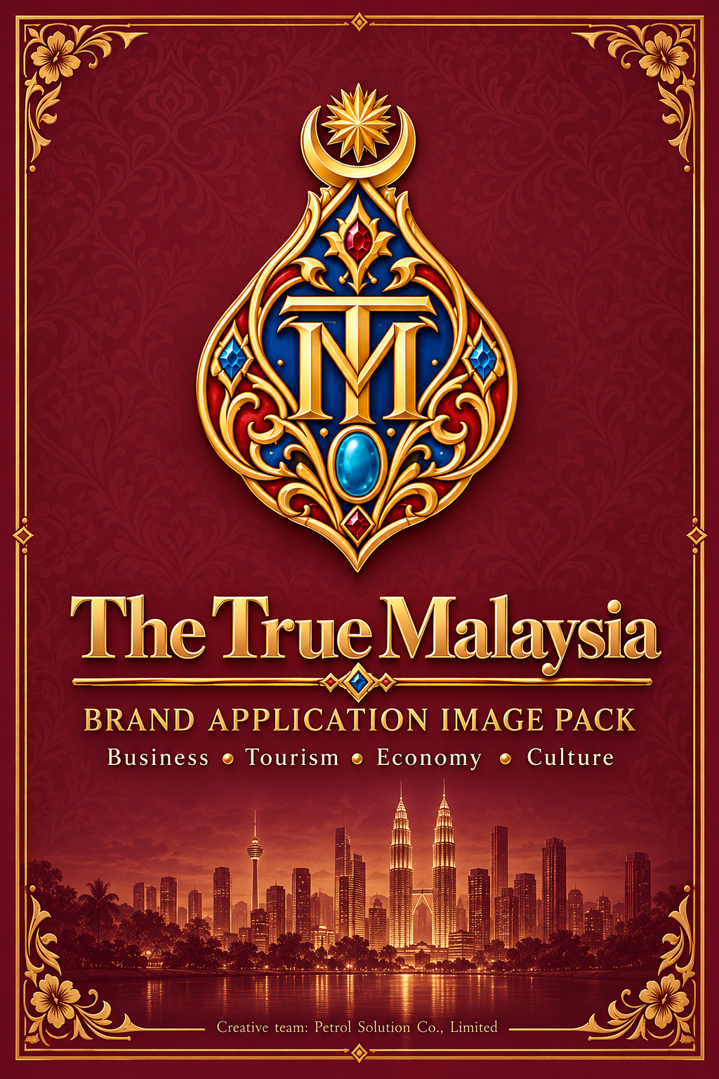
BRAND IDENTITY
TTM Brand guidelines
Explore the identity principles and brand applications of The True Malaysia across digital, corporate and public-facing settings.
A consistent identity across every touchpoint
The True Malaysia brings business, tourism, economy and culture into one independent knowledge platform. A consistent identity helps readers, contributors and collaborators recognize the platform across websites, publications, correspondence and campaign materials.
Proposed Applications
Brand applications
These images illustrate proposed brand applications. They do not represent existing installations, premises or institutional partnerships.
Brand book
Brand book cover
The cover treatment for the printed and digital guideline edition, pairing the wordmark with the burgundy and gold field.
Suggested use: Front matter for the guideline itself and for any printed brand summary.
Corporate stationery
Executive visiting cards
Business card faces showing how the mark, name and contact line sit together at small scale.
Suggested use: Card artwork for the editorial and partnerships team.
Corporate stationery
Stationery suite
Letterhead, envelope and compliment slip as one family, with consistent margins and a single accent weight.
Suggested use: Correspondence, formal letters and enclosures.
Corporate stationery
Stationery suite, extended set
A second stationery arrangement adding folder and insert formats to the core letterhead family.
Suggested use: Document packs, briefing folders and printed enclosures.
Stamps and seals
Rubber stamp and seal
A stamp impression and seal composition shown together on letterhead, at the size they would really be used.
Suggested use: Internal document marking. A corporate seal is not a legal certification.
Stamps and seals
Seal, close detail
The seal at close range, showing the relief depth and the clear space the mark needs when embossed.
Suggested use: Reference for die production and for judging minimum embossed size.
Pins, uniforms and team
Gold lapel pin
The emblem as a physical pin, where the jewel colours stay unchanged and only the metal finish is specified.
Suggested use: Team and representative wear at events and meetings.
Pins, uniforms and team
Team collection
Uniform, lanyard and accessory treatments kept quiet so the emblem stays the only strong element.
Suggested use: Event staffing, site visits and editorial field work.
Gifts and merchandise
Executive gift set
Notebook, pen and case as a single presentation, with the mark applied once rather than repeated.
Suggested use: Courtesy gifts for institutional meetings.
Gifts and merchandise
Luxury gift collection
A wider merchandise family — bag, mug, keyring and packaging — held together by one palette rather than one logo size.
Suggested use: Delegation gifts and long-form partnership courtesies.
Reception and signage
Reception showcase
The mark at reception scale, with the clear space the identity needs when it is the first thing a visitor reads.
Suggested use: Office reception walls and welcome counters.
Reception and signage
Office signage suite
Door plates, directional panels and wayfinding at consistent sizes and reading heights.
Suggested use: Internal wayfinding and room identification.
City, street and arrival
Lakeside plaza installation
A free-standing public installation, showing the identity at distance against open sky and water.
Suggested use: Civic or public-realm placements, subject to every required approval.
City, street and arrival
Heritage streetscape
Street banners against heritage frontages, where the palette has to sit beside existing colour rather than override it.
Suggested use: Street-banner campaigns in heritage areas, with local authority consent.
City, street and arrival
Airport welcome
An arrivals-hall treatment, read at speed by people carrying luggage, so the message stays to one line.
Suggested use: Arrival messaging concepts. Any real placement needs the operator's agreement.
City, street and arrival
Hotel facade campaign
A large-format facade application, where the mark is sized against the building rather than against the artboard.
Suggested use: Large-format concepts only. Not an existing campaign or a hotel relationship.
Events and exhibitions
Welcome entrance
An event entrance arch, treated as a threshold rather than a billboard.
Suggested use: Conference and exhibition entrances.
Events and exhibitions
Exhibition booth
A stand layout with the identity on the header and the content wall kept neutral so material can change.
Suggested use: Trade shows and sector exhibitions.
Events and exhibitions
Media backdrop
A step-and-repeat backdrop spaced so the mark survives being partly covered by people standing in front of it.
Suggested use: Press calls, panels and photo positions.
Vehicle
Vehicle wrap
A vehicle application that keeps the mark on the flat panel and avoids wrapping it across a curve or a door seam.
Suggested use: Field and logistics vehicles.
Digital and editorial
Website showcase
The identity in its digital home, where contrast and reading size matter more than decorative weight.
Suggested use: Reference for digital layout, spacing and heading scale.
Digital and editorial
Social channels
Post and profile formats where the mark has to work inside a small circle and a cropped square.
Suggested use: Channel profiles and editorial post templates.
Digital and editorial
Editorial video board
A motion and display treatment, with the mark held still while the content behind it changes.
Suggested use: Screen content, lobby displays and video intros.
Digital and editorial
Editorial report suite
Report covers and inside spreads, where the typographic hierarchy carries more weight than the colour does.
Suggested use: Research reports, sector briefings and downloadable summaries.
Brand Foundation
Identity principles
An independent platform
The True Malaysia is an independent country knowledge platform covering business, tourism, economy and culture. The identity must never suggest a government body, a diplomatic appointment or an official endorsement.
The supplied logo is the authority
Use the original master logo and the compact emblem as supplied. Preserve their proportions and clear space, and keep the emblem's jewel colours unchanged.
Burgundy, ivory and restrained gold
Burgundy carries the identity, ivory gives it room to breathe, and gold is an accent — never a colour for small body text, where it would fail contrast.
Readable before decorative
Headings stay refined and body text stays readable. A guideline that cannot be read at arm's length has failed, whatever it looks like on screen.
Respectful imagery
Show Malaysian people, industry, heritage and landscape with respect and accuracy. Keep natural skies, water and skin tones, and reproduce flags correctly.
A seal is not a certification
The corporate seal marks a document as ours. It is not a legal certification, an accreditation or proof of any approval.
Say when a scene is illustrative
Generated scenes are editorial illustrations. Give them clear provenance and never present one as a documented place, event or partnership.
Both languages, equally
English and Bahasa Melayu carry the same meaning. Neither is a summary of the other, and figures, dates and organisation names stay identical across both.
Colour and Typography
Palette and typography
- Burgundy#781E32
- Ivory#F7F3E8
- Gold#D4AF37
- Charcoal#2B2420
These are the manual's proposed working values, not formally approved website colours. The live site keeps its own approved tokens.
Headings use the platform's display face at a refined weight; body text stays at a readable size with strong contrast. Gold is reserved for accents and selected states, never for small body text.
Downloads
Guideline documents
Download English guidelines
PDF · 45 pages · 20.4 MB
Download Bahasa Melayu guidelines
PDF · 45 pages · 20.4 MB
Implementation
Putting the identity to work
- 1
Choose the application
Identify the office, publication, digital channel or proposed campaign setting.
- 2
Confirm the requirements
Check size, language, location and the information users should reach.
- 3
Prepare the artwork
Use original logo assets, editable copy and a checked production proof.
Get in Touch
Working with the identity
For questions about applying the identity, use the platform's general contact route. The True Malaysia is an independent information platform; listing an application here is not a partnership, an approval or an endorsement.
- Platform website
- www.thetruemalaysia.com
- Creative credit
- Creative team: Petrol Solution Co., Limited
A creative credit, not a statement of the platform's legal operator and not a government endorsement.